27 February 2010

It goes without saying

It goes without saying that this is probably not the best idea.


Read all about it here.


Springtime lighting

Thursday's New York Times ran a photo and a description of this ceiling light.


It's the Infiore Pendant by Estiluz, and I think it's pretty neat. It might be a symptom of frostbite though. Is any body else about done with winter? Geez!


Estiluz makes some really interesting, modern lighting. Estiluz is one of two lighting brands produced by Grupo Estiluz in Catalunya. That's a Province in Spain, for anyone who missed that day. Their manufacturing facilities are in the small town of Sant Joan de Abedesses, which is about 50 miles (80 km) north of Barcelona.

Estiluz is their modern brand and Blauet is their contemporary line.

Here's some more of their modern designs.


I've specifically not shown any of their contemporary stuff from Blauet, not that there's a thing wrong with it. I have an idea though.

Here's Blauet's website.

Here's Estiluz's website.

Now, what's the difference between modern lighting and contemporary lighting? Leave an answer of fewer than 500 words and the best answer wins a new range hood. Hah! No, there's no prize. I don't care if I never see another one frankly. Instead the winner will get something infinitely better than a thing. The winner will get the satisfaction of being smart.

26 February 2010

How much did you say that was going to cost?

This post was written by my friend Bob Borson, a Dallas Architect. He's also a blogger and writes Life of an Architect. He's entertaining, informative and nearly as prolific as I am. Check out Life of an Architect and give him a warm welcome please. Thanks! --Paul


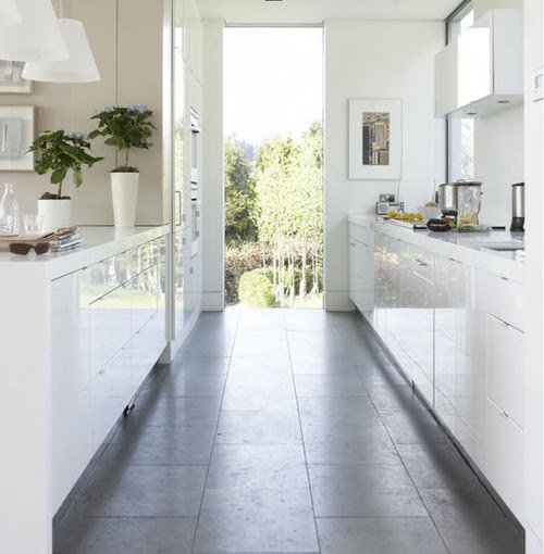
Modern design, including modern architecture, is experiencing a dramatic surge in popularity. More and more of our clients are coming in and asking for modern designs without knowing what it means to have a residence in the "modern" style. You can find modern design everywhere now --the background to every car commercial being made, to the checkout stands at your local grocery store.

"I wasn't looking at that issue of Women's Fitness, I was looking at this issue of... Dwell. Besides, she's too fit for my taste anyways"

There is also a massive disconnect between what it costs to build a modern residence versus what people think it costs. Modern homes, with their clarity often mistaken for simplicity, are extremely expensive to build.

In the decade after World War I, modern architects were interested in the "rational" use of modern materials (steel and glass most notably), the principles of functionalist planning, and the rejection of historical precedent and ornament. There was a widespread belief that building forms must be determined by their functions and materials if they were to achieve intrinsic significance or beauty in contemporary terms.

Okay - so put down that awesome issue of DWELL magazine - where the pages are adorned with the manicured images of kick ass looking houses populated by uber-cool, yet tragically forlorn, dual income homeowners. I am going to give you the starter kit of classic rules for modern architecture:

• adoption of the machine aesthetic
• materials and functional requirements determine the final product
• emphasis of horizontal lines
• express the structure of the building
• rejection of ornamentation - the simplification of form + elimination of "unnecessary detail"


and the most enduring, and most quoted rule of all:

Form follows function

What does this all mean to the 40-somethings that come in wanting a modern house?

Nothing … yet. I don’t need for them to understand the maxims of modern architecture --I’m just happy they care enough to hire an architect. My job is actually a lot more fun when I get to go through this educational process with them. This is a period when everybody loves each other --we’re meeting for coffee, I’m loaning them books on Marcel Breuer, Richard Neutra, Le Corbusier and Mies van der Rohe. Things are going great and I am their hero --leading them from the dark ages and the soul-consuming blackness that is the gothic builder home and into the light.

When you introduce “cost” into the conversation, things start to turn like a pork sandwich left out in the sun.

Client: “It’s going to cost what? It’s a concrete box with glass walls on two sides”
Me: “But we’ve emphasized the horizontal lines”
Client: “There’s only 7 rooms!”
Me: “Form follows function”
Client: “I’m not getting you”
Me: “uummm, we’ve adopted a machine aesthetic and expressed the structure?”


These are the critical moments with your client that separate the wheat from the chaff. It would be so much easier to take the client to a modern style house that was poorly (or cheaply) built where every single flawed issue of craft is exposed. The skill level needed from the contractor to plan ahead and adjust for dimensional "nuances" so that the joint pattern of the tile aligns with the window layout and that there isn’t any remnant pieces of leftover tile just before you get to the corner. Ever noticed that the openings in brick walls are the exact same size of the windows? That no bricks had to be cut? That meant the placement of every window in that wall was perfectly located months before any bricks even showed up on site. These things take skill to execute and just like everything else, skill costs money.

I’m not trying to say that contractors who build traditional style houses don’t have skill. What I am saying is that the skill level needed to build a house without ornamentation is higher than traditional houses because there aren’t as many ways to hide errors or “nuances.” How many traditional houses have exposed concrete floors? If you are going to be covering them up with a wood parquet floor, why pay extra to get the concrete floor perfectly smooth and level? If you are going to be slathering texture on the walls, why bother floating out the entire surface with gypsum to make it flat. Ever wondered why those old Fox & Jacob homes from the '70s had popcorn texture on the ceilings? Aaahhhh --it's all becoming clearer isn't it?

The best rule of modern design is probably one you’ve heard before but you thought it meant something else:

Less is More

25 February 2010

This is Layla


This is Layla Grace Marsh. She's a beautiful two-year-old in Texas. She's also got stage four neuroblastoma. Her mom's very active on the web and I was asked to write this blog post by Carmen Natschke from Decorating Diva and Christine Skaley from Pillow Throw Decor. Both of those women are terrific friends of this blog and so I want to pass along a story from them.

Layla was an otherwise normal baby until she developed abdominal pain at about 15 months of age. Her parents thought they were dealing with routine digestive problems but found out instead that their baby had stage four cancer. I cannot imagine how devastating such news would be.

Layla's mom is Shanna Marsh, who wrote the website Baby Wears Prada. Since Layla's diagnosis, Baby Wears Prada has morphed into a Facebook Fan Page. Shanna and her husband Ryan have also been keeping up the website Layla Grace. Their site serves as a way for them to document their daughter's life and as someone who writes into the ether on a daily basis, it's got to be a tremendous relief to have it as an outlet for their thoughts.

On a day when congressional leaders and the President of the US met to discuss the pressing need for healthcare reform, it's instructive to note that Layla is dying. Her family will not only have to deal with the death of their child, but also the medical bills not covered by their insurance. At this point, those bills are in excess of $100,000 and climbing.

Christine is coordinating a creative fundraiser through her blog and you can find all the details there. Please follow the link over to Pillow Throw Decor and count your blessings while you're waiting for the page to load.

What about a white kitchen?

Houzz is a terrific, relatively new website for house ideas. It's growing rapidly and visitors are encouraged to got through Houzz's extensive library of images and use them to construct idea books of their own. It's a brilliant idea for a bunch of reasons, foremost among them is that it encourages people to do what they'd do anyway. And that's save images they find on the internet.

Houzz has gone a step further in that a photo can't be separated from the name of the designer who created the room. It really smart actually.

Houzz's library contains over 25,000 home design photos, so if you're looking for inspiration, you'll likely find it on Houzz.


kitchen remoldel


These photos are from an ideabook that was assembled for Houzz by Margaret Everton, a designer who writes a blog called Bon Bon Living.


main-5.jpg (image) modern kitchen


I grabbed these photos today for a couple of reasons. After yesterday I wanted to clear the air and write about something basic and non-confrontational. And secondly, I've been getting a lot of requests for white cabinetry lately.


main-7.jpg (image) modern kitchen


White cabinetry is simple, basic and classic. When I think of a white kitchen I think of solid tradition and dependability. It's like some kind of a rock, a solid thing you can anchor yourself to.

UWS Kitchen contemporary kitchen
contemporary kitchen design by new york interior designer Lea Frank Design

I love this photo, absolutely love it. It's my every life in Manhattan fantasy made real. Anyhow, I think there's something more at work here than just a shift in aesthetics. The white cabinetry thing is showing up across all styles.


SchappacherWhite Ltd. modern kitchen


I think the white thing is in reaction to these uncertain times. I don't think this is coming from some nostalgic look backwards. I think it's coming from some kind of a need for a solid foothold.

What do you think? Am I nuts? Would go go for a white kitchen? And while you're pondering the imponderable, check out Houzz. They have some pretty cool stuff.