11 March 2012

Anthroplogie continues to offend

I walked past an Anthropologie store in New Orleans this week and was mortified to see their store windows decked out in some bad reproductions of Mark Rothko's work and they were calling it and their new collection as "Abstract Expressionism."

I can sense that Rothko would have been mortified by not only his being classified as an Abstract Expressionist, let alone being the pivot point of a marketing ploy to sell overpriced, unattractive crap. Rothko was a Russian emigre whose family fled the last gasps of the Czarist pograms as the Bolsheviks conducted a bloody coup over the Romanov autocracy. He and his family barely escaped Russia with their clothes on their backs.

The Rothko family was fortunate to escape while they could and so they ended up in New York and then later moved onto the Pacific Northwest.

The Rothkos (nee Rothkowitz) family suffered mightily. They were poor but they managed to keep it together despite their circumstances. By all accounts, Mark Rothko was brilliant and he ended up at Yale.

In the 1930s he started to paint, and his subjects shifted from the Cubist/ Primitivist styles of his contemporaries to something utterly new. By the time the 1950s rolled around he was breaking new ground with a perspective that came to be called "multiforms." These multiforms were in essence individual photons of light, the smallest part of an artistic vision. Take a look at these paintings and imagine what he was looking at when he painted them.


That imagining is the whole point of Rothko's work. It makes me want to look at the parts that make up everything. No one had ever painted that way before and he pioneered the very thought of a pixel. He was painting in the 1950s something many of us take for granted now.

So what does any of this have to do with Anthropologie? Nothing, that's what. How do the get from this great, thoughtful art to this thing?


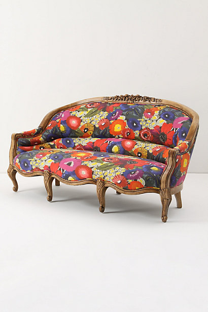
This sofa's offensive because it's hideous for starters. It's doubly offensive for its $3200 price tag. What makes it trebly offensive is Anthropologie's attempts to sell this crap off the back of Mark Rothko.

Don't buy into it. An ugly sofa is an ugly sofa, despite the marketing hoo-hah that surrounds it. There is nothing about a sofa with that price tag that harkens back to anything but bad taste. Enough, enough, enough.

I have no problem with $3200 sofas, provided they're well made and look like something other than a trail of cat sick. But asking people to spend that kind of money on a piece of furniture that's purposefully ugly and is being hawked by using one of the greatest minds of the 20th Century is just plain wrong.

What do you think? Would a sofa that looks like this and with this kind of back story ever figure into your home?

Go see this movie

I had the good fortune to see The Artist this week. I can't remember a film that's entertained me and made me think so much at the same time.


The Artist is a joint French and US endeavor and the entire movie is carried by this guy, Jean Dujardin. He deserves every accolade he gets.


Yes it's in black and white and yes, it's for the most part a silent film. However, it has a story to tell that won't quit. In addition to all of that haute film making, it has some great hoofing.


Not bad for a guy who used to be a Parisian general contractor. Would that all the building professionals I know tap danced like this.

Go see this film and if you have seen it already, let me know what you thought of it.

10 March 2012

Notes from New Orleans and the cities of the dead

One of these days I'll get back to writing about kitchen and bath design but in the meantime, I'm going to continue to write about whatever comes to mind. Bear with me. I'll get back to my niche eventually.

via

I spent a good part of last week visiting some long-term friends (Kevin Smith and Brandon Bergman) in their new hometown, New Orleans.

While the rest of the world thinks of New Orleans in terms of Bourbon Street and the shenanigans that accompany Mardi Gras; or the horrors it suffered when the infrustructure failed in the aftermath of Hurricane Katrina; there is much more to that city. It's a place that doesn't feel like the rest of the United States, and the city's conventions and norms make it unlike anywhere else. New Orleans feels like a place without a time or a country and it serves as pressure valve for the world.

I have a number of friends who've moved there over the course of the last four years from Florida. Collectively, I refer to them as economic refugees. People who moved to New Orleans to seek their futures as the city rebuilds itself in the aftermath of Hurricane Katrina.

New Orleans is back in a very big way and it's a real thrill to watch my friends there riding the wave of the Crescent City's rebirth; FEMA, BP and the Army Corps of Engineers be damned.

Rebirth isn't really the right word though. New Orleans has been through the mill since its founding in the early 1700s as La Nouvelle-OrlĂ©ans. The city passed from French to Spanish and then back to French hands before it became part of the US. Huge amounts of that pre-US infrastructure still exist and it's impossible when in the heart of the city to keep an accurate count of the 18th-Century structures that are still in day to day use.


Beyond its architecture, the culture of New Orleans stands apart from the rest of the US. While it's a thoroughly American city, it retains a feel for its founding cultures that the rest of the US has lost utterly. One of the things that amazes me more than just about anything is its numerous "Cities of the Dead," as cemeteries are known.


I had the pleasure to spend a leisurely afternoon this week in Lafayette #1, one of New Orleans' cemeteries in the city's Garden District. Lafayette #1 was established in 1833 and is a perfect example of how the City has sent her residents to their final repose since the city's beginnings.


Unique in the United States, New Orleans disposes of its dead in above-ground crypts rather than burying them. The going story is that the crypts are a function of the city's low topography but that's not really true. It's as much a throwback to its Continental roots and the reality of its lack of space as anything.


The crypts of New Orleans, like everything else about the place, have an interesting story to tell.

Crypts are owned by families or organizations and the crypts sit on leased land.

When someone dies, he or she is placed on the shelf shown here and the crypt is then sealed.


After a year and a day, the crypt keeper opens the crypt and with a ten-foot pole, pushes the remains to the back of the shelf. At the back of the shelf there's a slit and the remains fall through that slit and drop to the bottom of the crypt. The crypt is now ready for the next family death and it's re-sealed. According to the lore of New Orleans, this is the origin of the expression, "I wouldn't touch that with a ten-foot pole."

On All Soul's Day every year, the people of New Orleans lay tribute in front of these crypts in the form of flowers, beads and other mementos. It's a touching gesture of respect of the deceased.

Not all crypts are owned by families. Some are owned by fraternal organizations or charities. While at Lafayette #1, I came across a large crypt owned by the Society for the Relief of Destitute Orphan Boys, an organization that still exists in New Orleans.


In the most touching example of an already touching practice, the ledge on the face of the crypt was filled to overflowing with toys.


New Orleans is an amazing city and one with a legacy it's all to willing to share with anyone who asks. So head there some time and ask.

28 February 2012

That song that's stuck in my head: a Blog Off post

Every two weeks, the blogosphere comes alive when bloggers of every stripe weigh in on the same topic. This week's Blog Off is about songs that get stuck in your head. Here's my take.

-----------------

I fly in and out of the Tampa airport with alarming regularity. According to FourSquare, I've checked into that airport 28 times in the last six months. It's a great airport so far as airports go and obviously, I spend a fair amount of time there.

via The Decorating Diva

Every time I retrieve my car and drive home I pass a stand of oak trees at the entrance to the airport. All of them have a yellow ribbon tied around their trunks. A yellow ribbon tied around an oak tree has become the de facto statement of hope for the men and women who are in the armed services. Those ribbons are a stand in for "supporting the troops." I understand the sentiment behind those ribbons, but wouldn't it be better if the United States kept young men and women out of harm's way to begin with? Had the US not invaded Afghanistan and Iraq in the first place, there'd be no need to tie yellow ribbons around trees. If the energy expended in those ribbons were directed toward electing politicians who didn't buy into the idea that the US is the world's police force, we'd be a better country. If you want to "support the troops," work to bring them home.

via

Anyhow, every time I pass that stand of beribboned oak trees, it's 1973 all over again and this song bores its way into my brain:


The only thing I can do at that point is crank up my Twitter buddy Joseph Calleja's E luceven le stelle from Puccini's Tosca. He's also my favorite contemporary tenor and a good guy. Even if you don't get opera, the man has a voice that won't quit.


I cannot get enough of his singing. So far as I can tell, Calleja's the only cure for a Tony Orlando and Dawn earworm. I've seen him perform twice by the way, each time in New York. On my bucket list is seeing Calleja in Tosca at La Scala in Milan. One of these days...

What songs bore into your head? What prompts that boring and how do you get rid of them?

Check out how other bloggers address this topic by clicking on the links in the following table.


27 February 2012

What's that color?

I get at least three e-mails every week from readers of this blog and other things I've written around the internet. This is immensely gratifying and most of these e-mails are questions about a photo or a request for advice about flooring, appliances, counter materials or cabinet brands.

via

I'm glad to answer these questions and I love that strangers look to me as a source of solid information. However one question I'll never answer definitively is "What's that color?"

This happens most often in response to the things I've written for Houzz.com. It's a legitimate question and every time someone asks it I launch into what's by now a rote speech.

The short answer is that it doesn't matter because you're not seeing the actual color. What human eyes see as color is reflected light and how a color reads in a photo is completely dependent on how a subject is lit at the time the photo was taken. So the act of photographing something distorts its color, sometimes pretty radically. So that's one degree of distortion.

Add to it that you're seeing that photo on an uncalibrated computer monitor and that's at least two more degrees of distortion.

After all those distortions, the nuance of the original color is lost for good.

Photos on the internet are good for general families of color. You can look at a photo of a room and know that you want a yellow kitchen or a taupe living room. But the actual colors used in the photo won't look in your home the way they do in the photo you're admiring.

Here's a detail of a kitchen I designed. The wall color is Sherwin-Williams 7037 and I picked that color because it played well with the off-white cabinetry paint color and it was as similar hue to the brown veins running through the Calacatta marble on the counters and back splash.


If I were to go to Sherwin-Williams' website and look at the swatch, here's what I'd get.


Even though they're same color, they look nothing like each other. What's more, the color as it appeared on the walls was off from the swatch in my Sherwin-Williams chip library.

The difference between a paint swatch and actual paint is typical, and a good designer knows how to accommodate it. The difference, by the way, is due to the fact that a paint swatch is a printed approximation of a paint color as it will appear with an eggshell sheen. Paint swatches are never the actual paint. Different sheens make even the same paint colors look completely different.

So the answer to "What's that color?" isn't an answer. Rather it's an explanation, and a long-winded one at that. It's impossible to specify precise colors with photos and even more impossible to do so with an image on the internet. The only way to gauge true color is to paint a wall, let it cure for a day and then decide whether it works or not.

I know that's not the advice most people are looking for; but it's the cold, hard truth. Use photography, be it on the internet, in a magazine or in the marketing collateral from a paint brand as a general guideline to help you identify a direction. But until a paint color hits the wall, you'll never know how it will actually look.

So go ahead, ask me anything. Just don't ask me what color something is.