29 February 2008

Here's a toilet with a twist

When I was a wee lad, my family had a cottage in rural Ontario where we would go every summer for vacation. It was rural on a scale that makes my head spin now, but at the time it was a great adventure. We had no electricity, no running water and we had what I now know to be a pit toilet in the bathroom. It was an awful, foul-smelling affair; essentially an indoor outhouse. A pit toilet is a toilet with a large hole in the bottom of it. The toilet sits over a cistern and whatever goes into it lands with a splash after a short delay. But when you're that far from civilization and you have no access to running water, hygienic options are limited. Unpleasant to remember as an adult and the horror to end all horrors when you're nine. Anyhow, I like to keep an eye on the horizon with regard to home building trends and sustainability is very much one of my buzzwords. What does this have to do with a pit toilet in an otherwise charming cottage in the middle of nowhere? Pay attention. I was watching a TV show on sustainable building recently and the show's host dropped in on the Bronx Zoo to check out a new public restroom they built. The Eco Restroom at the Bronx Zoo accommodates a half million people a year and uses 3 oz. of water for each time one of those visitors flushes a toilet. The host was saying that the eco-restroom saves a million gallons of water a year using a composting system instead of the typical low-flush toilets required by building codes. I heard composting toilet and flashed back immediately to the pit toilet of my childhood. But I kept watching, despite my negative associations. It turns out that a composting toilet is nothing like a pit toilet. It is an odorless, closed system that turns human waste into fertilizer. Most of them use no water at all, but the system the Bronx Zoo uses a tiny bit of water to generate foam from biodegradable soap. This foam allows a foam-flush composting toilet to look and behave like a conventional toilet. The image above and to the right is how one looks, and below is a diagram that shows how it works. Our society expends tremendous resources securing a safe, clean water supply for everyone. Then as individuals, we turn around and flush 40% of that clean, safe water down the toilet. If that weren't wasteful enough, the resulting effluent needs to be treated at more great expense only to be dumped into nearest body of water after the solids have been removed. Yet no one seems to know why red tide blooms are so bad in my beloved Gulf of Mexico. This system, like so many other ones, is unsustainable. It's unsustainable economically as well as environmentally. But there's a solution out there and utilising that solution will require that folks get over some of their squeamishness on the topic. The system at the Bronx Zoo was installed by a company called Clivus Multrum  in Massachusetts. Clivus Multrum refined and brought to market the idea of a modern, composting toilet more than 30 years ago. Clivus also invented the foam-flush toilet. How their system works is pretty simple and straightforward. Human waste is kept in an enclosed chamber and time, biology and gravity work together to turn that waste into fertilizer. There's no stink, no mess, no polluted groundwater, no expenses related to what to do with it. Not to get all granola or anything, but what it does too is return to the soil the nutrients you didn't need. There is a whole subculture out there dedicated to composting toilets I'm learning, and a clearinghouse for information on the subject is a website called Composting Toilet World. That sounds like the name of a particularly spooky campground or something, but they have some really great information and resources. Now I love the idea of a dual-flush toilet, but the idea of a composting toilet takes the idea embodied in a dual-flush and takes it to an extreme the purist in me loves. All Hail Clivus Multrum!

28 February 2008

Can a toilet be Modern?

I have been granted a tremendous opportunity to design a Modern bathroom. I mean a really Modern one filled with all of the glory and wonder that minimalism can bring to a space.

I've done Modern-ish ones before, in the style we call "Transitional Contemporary" in the trade. Transitional Contemporary is not Modernism, although it gets mistaken for it with alarming regularity. Transitional Contemporary can be attractive and fun, and because it's such a loosely-defined term, it's really flexible. As a designer, I have a lot more leeway in Transitional Contemporary because I don't have to be such a stickler for form.

Most times, when I'm putting together a plan for a bathroom, I put the toilet in a separate water closet inside of the main bath. I do that nearly by reflex because that's what everybody does when you have the room for it. Just put the thing behind a door and then you don't have to think about it any more.

I've never really thought about why everybody does it that way, but my current Modern Bathroom may have given me the explanation.

The American toilet looks like this and has since the dawn of indoor plumbing. Sure, there are some variations on this theme, but the typical toilet available in the US today looks just like the one that was in the house where your grandmother grew up. That this is what a toilet looks like now and always has is at the root of why people like me shutter them away in water closets out of reflex. I mean, who wants to look at that?

When I go through my catalogs of modern pluming fixtures, I see beautifully minimalist sinks and shower pans and faucets but invariably, there is no toilet in the collection. I suppose that since everyone keeps them out of sight, there's no need. Well, my current project is one of the exceptions to the have-enough-room-for-a-water-closet kind of master baths. I don't have enough room to hide anything but the plumbing, and this baby's going to be a wide open space. Finding a Modern toilet that will look great with the modern sink, tub, shower and faucets I'm already looking at will be tough. Or at least I thought until I came upon my new friends at Blu Bathworks (http://www.blubathworks.com/) this morning.

Blu Bathworks is a Canadian company that does virtually nothing but make and sell Modern plumbing fixtures. As an added bonus, all of their products strive to maximize the efficiency of their water use and utilize technologies like the dual-flush toilet I've written about previously. In keeping with the Modernist propensity to shrink the profiles of ordinary objects, a lot of their toilets appear to be tankless such at the Metrix to the right. The toilet still has a water tank, it's just hidden in the wall behind the toilet. That hide-the-tank-in-the-wall mechanism is called an in-wall carrier system and is itself a pretty slick piece of engineering. But not content with toilets, Blu has a line of coordinating bidets. Bidets make some people giggle and feel uncomfortable. There a lot of chatter about them being unecessarily indulgent. Let me state for the record that the people generating that chatter have never spent a whole lot of time with a bidet. Spend a week with easy access to one and you will never think of them as foolish again. Man! Talk about hygeine!

26 February 2008

Let's talk about sinks ba-by

Somebody asked me about "farm sinks" today and I launched into one of my odes of joy on the subject. But first, let's clarify the language we're using. The correct term for them is "apron-front" not "farm." A lot of times, you can see these sinks in some pretty countrified kitchens and I'll admit that some of them do lend themselves to that particular "style," if I can use that word.

However, using the term "farm" to describe them does do a disservice and it paints them into an unnecessary corner. They are not so much countrified as they are traditional. To the right is a Shaw's Original, which started the whole thing in 1897. The Shaw's is still made by Rohl (http://www.rohlhome.com/) and one of the things that makes a Shaw's a Shaw's is that it's made from fire clay. Fire clay is a very specific kind of high temperature ceramic. It is the same thing that blast furnaces are lined with. When it's used as a kitchen sink, it is a material that's impervious to both insult and injury. Unlike a lot of materials, you can scrub fire clay to your heart's content and you will not scratch it. It doesn't stain in the first place, so if you do end up with a can of Ajax in your hand you might want to take a look at that. Anyhow, the Shaw's is a classic and as such it works well with virtually any aesthetic, from traditional to modern.

Once you leave the Shaw's behind though, there are a nearly uncountable number of options out there and I'm seeing a lot more of these things being made from metal. Here's a more traditional metal sink by Native Trails (http://www.nativetrails.net/). This sink is actually hand made from hammered copper with a layer of nickel over top of it. Copper is a highly reactive metal and it takes a long time for it to achieve something approaching a uniform patina. It'll be gorgeous when it gets there, but it will be anything but along the way.


The beauty to the left is a 12-gauge stainless steel sink from Bates and Bates (http://www.batesandbates.com/). The lower the gauge number the thicker the metal. A $200 sink from a home center will be 20-gauge and that's a hair thicker than aluminum foil. At 12-gauge, this baby will lack the tell-tale sound that people associate with dropping something into a metal sink. No gong here. That it's pieced and welded together instead of being stamped (the flat bottom is a dead give away) along with the superior grade of the metal are why this is a $3500 kitchen sink. You can pick yourself up now. Strange as it may sound, the world is full of people who will spend that kind of jack on a sink.


Kohler (http://www.kohler.com/) came out with their stainless steel apron-front a couple of years ago and I think I've used the Kohler Verity more than any other apron-front sink in my kitchen work. While still by no means an inexpensive sink, the Verity is more like The People's version of the Bates and Bates. Still gorgeous, though the metal isn't as low a gauge. It can be found for anywhere from $800 to $1000.

Due in a large part to their traditional roots, most apron-fronts are single bowl sinks. Since running a dishwasher is a less-wasteful use of electricity and water than hand washing dishes(counter intuitive I know but true true true), having a single bowl looks better and is all most people need. However, there are double bowls out there and our friends at Blanco (http://www.blanco.de/) have a really nice one. Blanco is a German brand that exceeds the stereotype of German efficiency and innovation. Good Lord I love a right angle and that sink over there has enough to keep me happy for the rest of my life.

So I think I'd be willing to say that although the apron-front sink is not new, it is very NOW.

25 February 2008

Oh vanity of vanities; my bathroom

This is the Memoirs Suite by my friends at Kohler(http://www.kohler.com/). For the last couple of years I've been specifying plumbing fixtures for the higher end of the market but I'm working on something right now that's on a more resonable budget. It's interesting to recommend things that I could afford instead of things that I admire but probably would not buy for me. Probably wouldn't? Who am I kidding?

Anyhow, I've been reviewing some of the new stuff that Kohler's been putting out and they have really turned that brand into something great from an aesthetic point of view. I'm a pretty die hard modernist when it comes to things that I like, but I rarely get the opportunity to advise people in ways that appeal to me as well. One of the things that makes me a designer is that I can set aside what I like and instead show people what they like. That said, the bath fixtures for the project I have in mind are going to be Kohler all the way.

Even though the fixtures in the suite above are pretty traditional, they are clean and classic and I'd nearly forgotten how much I like the entire Memoirs collection. What's great about selecting fixtures from a collection by Kohler is that you can buy an entire suite. That is; the toilet, lavatory, faucets, etc. will all share the same design. Although they aren't giving anything away, Kohler represents a good marriage of beauty, quality and price. They have a lot of value, even if they aren't going to be the cheapest thing out there. When it comes to plumbing fixtures though, you do not want the lowest-price stuff. Trust me on that. The $100 toilet on an end cap at Home Depot is a heartache in a box. Don't do it! Sometimes, it costs too much to save a couple of bucks.

Kohler's also introduced the Persuade toilet. Even though it's not part of a suite, it is a dual-flush toilet that retails for under $400. All hail Kohler for that. From what I can tell, it's their only dual-flush model. It is the tip of an iceberg though. Dual-flush toilets will be standard issue within the next ten years, mark my word.

Kohler has been buying up a bunch of high-end brands in recent years and they've been using the higher-end stuff they own to bring up their flagship brand. Kallista (http://www.kallista.com/), Barbara Barry (http://www.barbarabarry.com/), Walker-Zanger (http://www.walkerzanger.com/), Ann Sacks(http://www.annsacks.com/) and Baker (http://www.kohlerinteriors.com/) to name a few are all held under the Kohler flag and it shows. Ann Sacks tile is a eye-poppingly beautiful as ever yet a lot of Kohler's sinks show a definite Sacks-ian influence. I was surprised to see this toilet seat on Kohler's website, things this well-made were once the sole province of luxury brands, but not any more.

You can spend more money that what you'll find through Kohler, but I doubt you find more value in consumer-grade plumbing fixtures.

22 February 2008

Contain yourself

The image to the left is an interior shot of a home designed by a visionary architect named Jennifer Siegel. The home Ms. Siegel designed here first came to my attention in Dwell magazine and I was reminded of her ideas when I was thinking about sustainability this morning. Sustainability is the new buzzword of the design and architect worlds, and it's a steaming locomotive on its way to you.

I've written for the last couple of days about wasteful practices and their unsustainability over the long term. I think the current housing market mess and mortgage industry debacle are a another symptom of this unsustainability. Housing prices have increased dramatically in the last 20 years. Increased to the point where typical wage earners can no longer afford to buy a home in a desireable part of the country. The market reaction to that unaffordability was to get creative on the financing end of it and the results are splashed across the headlines every morning. Everyone seems hell-bent on fixing the problem by bailing people out of bad mortgages on homes they can't afford. The blame seems to have settled exclusively on the mortgage industry. Oh, there's plenty of blame there, but it's not the whole story. Building costs have soared and it's not due to greed on the part of the building industry either. Concrete really does cost a lot more now than it used to. Ditto lumber and finishes and labor and all the rest. What people consider to be an adequate and appropriate home has reached the point of unsustainability, just like their water use has. It's time, high time, to look at what constitutes a house.

At current rates of population growth, the US will need an additional 427 billion square feet of space by the year 2030. That's a lot of room for a lot of people, most of whom cannot afford to spend $300,000 on a stucco split level on a cul de sac. So what's there to do?

The house above is made from discarded shipping containers. The unintended consequence of our trade imbalance with China is that every day, ships laden with goods arrive in US ports and get unloaded. Because we buy so much more than we sell to them, for most of those containers, it's a one-way trip. So they pile up in New York and LA and Miami and Tampa and San Francisco and New Orleans and they sit there.

A growing group of visionaries is looking to them to solve two sustainability problems at once. How do you build interesting, affordable housing that will allow builders to make enough money that they will build it and what the hell are we going to do with that mountain of shipping containers along the expressway. The answer is build houses. Interesting, beautiful, sustainable houses that people can afford. There is an entire web subculture out there on the topic and two places where I've been reading up on this are a blog called Treehugger (http://www.treehugger.com/files/2005/01/shipping_contai.php) and an architectural clearinghouse called Fabprefab (http://www.fabprefab.com/fabfiles/containerbayhome.htm).

It is not 1945 anymore and it's time to stop looking at housing and commercial construction as if it were.

21 February 2008

This toilet will change your life!

This is the Aquia toilet by Toto (http://www.totousa.com/). What it carries is a technology that new in the US, but is ubiquitous throughout the rest of the developed (and a lot of the developing) world. What our friends at Toto have done is brought this "new" idea in toiletry (is that a proper use of the term?) to the US market and how it hasn't taken off shocks me.

The Aquia is a dual flush toilet. What that means is that the flush button on the top of the tank is split into two sides. Pressing the left side initiates a .9 gallon flush. We'll call that the number one side. Pressing the right side gets you a 1.6 gallon flush and we'll call that the number two side. It makes sense, perfect sense; yet if you ask for one at a Home Depot or a Lowe's you will be met with the blank stare of the tragically unaware.

The United States is on a collision course with a water disaster. The conventional vision of what constitutes a decent lifestyle is unsustainable. The problem is not the US standard of living. The problem is the way Americans use their scarce resources. Real high on that list of misallocated and misunderstood resources is clean, safe tap water. That drinking water gets used to irrigate lawns, and to hose off sidewalks, and to wash cars, and to flush toilets is madness. Madness!

Average, daily, per capita, household water use is estimated to be 69.3 gallons. I live in a city of 250,000 souls and that means we consume on average 17,325,000 gallons for household use every day. But that's using a national statistic to get a local result. The per capita household number in Saint Pete, Florida is actually 89 gallons. That means Saint Pete needs 22,250,000 gallons of water a day for showers, tap water, dishwashers, clothes washers, lawn sprinklers, swimming pools and toilets. That is a lot of water. It's a lot of water that needs to be piped in from counties other than our own. Add in the needs of the 3 and a half million other souls who share Tampa Bay with us and that is a huge amount of fresh water that's piped into this burgeoning region of the country. I'm not the first person to say this, but it can't last. The Florida aquifer where that water comes from is in trouble and there are Draconian measures in the works.

It is past time to rethink the way we use water. Going back to that 69.3 gallon per capita average, 18.5 gallons of that total goes to toilet flushing. 18-and-a-half gallons of fresh, treated, potable water gets fouled every day to dispose of about a quart of waste, pardon my indelicacy. Those 18-and-a-half gallons are a logical place to look to cut back on overall water use. The dual-flush toilet is a perfect step in that direction.

My water-use statistics came from The American Water Works Association, a trade group for the US water industry. You can review their figures yourself and find some great ideas about water conservation on their website, http://www.drinktap.org/. My local use statistics came from the Pinellas County Utilities Commision, http://www.co.pinellas.fl.us/.

Contrary to what you'll hear from the Rush Limbaughs of the world, water conservation is not a concern that's the sole province of the soft-hearted and soft-headed. The water problems the US are steaming toward are real and they will be ugly. However a pretty toilet from a Japanese plumbing company might be enough to hold all that nastiness at bay. For a while anyhow.

20 February 2008

Sofas, sofas everywhere but not a place to sit.


I have been on a quest for the right sofa for my living room for the last couple of years, and I'm proving myself to be my own worst client. I can't pick furnishings for myself to save my life. In the course of all of that back and forth I've learned a lot about sofas and even though it hasn't helped me decide between a Mitchell Gold and a Barbara Barry it helps me find better stuff for my clients. So if it's sofa time for you, pay close heed to some tips about what makes a good sofa good in the first place and why good sofas are so bloody expensive.

A sofa starts with a frame. In better furniture, that frame is made from kiln-dried hardwood. These hardwoods are kiln-dried to remove any residual moisture and to prevent later warping or cracking. In less-expensive furniture, that hardwood frame is replaced with furniture-grade plywood. A hardwood or furniture-grade plywood frame is the first thing to look at if this is a piece of furniture that will get a lot of use and that you expect to hold onto for a long time. A good sofa is screwed and glued at its joints and its corners are reinforced with blocks. These are things you cannot see, so ask your salesperson about a sofa's frame construction and you should hear something like what I just wrote. If he stares at you blankly, leave the store immediately and go somewhere else.

If you're looking for something that won't get used a lot, or that you expect to get rid of in a couple of years; a frame made of particle board is for you. The particle board frame won't keep its shape over time and its joints will eventually break. The $7,000 Henredon sofa and the $900 knock off of it at Ikea may look similar on the outside, but it's the insides that count here.

If you spend any time in furniture showrooms, you hear the term "hand tied" bandied about but no one really gets into what it means. What the term refers to is the sofa's suspension system. The suspension is the second element that separates better furniture from cheaper furniture. "Hand Tied" is shorthand for eight-way hand-tied steel-coil system --called this because each steel coil is attached at eight different points to other coils and then the whole system is attached to the frame. This allows for the coils to operate independently, but not too much. The result is called the sofa's "ride," or how it feels when you sit on it. The hand tied method of using coils is regarded by the industry as the best marker of quality and you can be sure that the $7,000 Henredon has hand-tied coils. Down from that is a drop-in coil system where the individual coils are clipped to one another and then clipped to the frame. This system won't last as long and will give a more uneven ride. Finally, our $900 example will likely have what's known as sinuous construction and it will be the shortest-lived of the three methods here. Sinuous, or zig zag, construction uses S-shaped steel wires that run from side to side of the frame. Sinuous suspensions are stiffer and are omnipresent to the point that most people expect a sofa to feel the way it does with one of these suspension systems.

But more than the other two categories, the largest driver of a sofa's price is the fabric it's upholstered in. There is a staggering range of fabric qualities out there. And as is the case with a lot of things, if you don't know what quality is, don't learn or you'll spend fortunes chasing it. An upholstery fabric should be attractive, obviously; but it needs to be resilient and easy to clean as well. The tag on a sofa will tell you how it can be spot cleaned through a series of codes. Guard your sanity and avoid anything labeled "Brush Clean" only.

Always ask how long the lead time is for the delivery if it's a custom piece. Typical turn arounds range anywhere from one month to nine months. Know going in that the minute you customize a piece of furniture is the same minute that it stops being returnable. Think about this for a while and look at the fabric swatch in your own home before you buy anything. Do your homework, pick something and get on with it. That sounds like good advice for me too.

19 February 2008

Angst and ennui in a cul de sac

Today's New York Times has a great piece on their website in the form of one of their bloggers, Allison Arieff. Ms. Arieff is the former editor of the great magazine Dwell and she writes about architecture, design and culture. Her blog entry can be found at: http://arieff.blogs.nytimes.com/2008/02/18/is-your-house-making-you-look-fat/index.html

Her topic today, sustainable development, dovetails neatly into my entry yesterday about environmentally-friendly cleaning products and household goods.

The image here of a cul-de-sac'd suburban neighborhood has become a redefinition of the American Dream in the last 50 years or so and the growth of this kind of inefficient development is at the root of not only the environmental crises we face, but I say that it can be faulted for everything from trade imbalances to childhood obesity to school shootings. It is development on an inhuman scale. The conceit it relies upon is the idea that you can cram people into a space and allow them to live in isolation. Neighborhoods such as this one are completely automobile-dependent and the only way a resident can interact with someone who lives 20 feet away is to go out of their way to do so.

So long as this kind of suburban idyll holds its place as an American Ideal, we're doomed. Life in one of these places makes walking anywhere but to the garage difficult and pointless. Since all of the homes in the neighborhood are worth the same amount of money, there can be no economic diversity among its residents. An endless parade of cars and garage doors doesn't lend itself to neighborly behavior. Backyard fences you can't see over keep over-the-back-fence conversations to a minimum.

I live in the Sunbelt, a place whose suburbs and exurbs look just like the photo above. People line up to move into these neighborhoods and in exchange get to live in solitude among strangers a half an hour from the grocery store and an hour from work. I live in an area that gets around 50 inches of rain a year. Those 50 inches fall mostly between the months of May through September with nary a drop in between. Yet, due in a huge part to the inefficient use of the soul-deadening cul de sac school of suburban planning, we face chronic water shortages. Thousands of acres of small lawns that need to be irrigated with potable water cause these water shortages. The sprawl of suburbia is as unsustainable ecologically as it is economically as it is psychologically.

But there's hope. The sale of new homes fell by 26 per cent last year country-wide. Yet, in order to keep up with projected population growth, the US will need an additional 427 billion square feet of space by the year 2030.

Maybe the upside of a down housing market is that it presents a rare and valuable opportunity to re-think the way that we, as a society, house people. Maybe development on a scale that accommodates human needs over automotive needs is something to explore now that there's a lull in the action. Imagine what would happen if somebody started to build communities that actually built communities. Imagine.

18 February 2008

$9 window cleaner? Give me a break!

The same magazine I mentioned yesterday, Domino (http://www.dominomag.com/), has a feature this month on environmentally-friendly cleaning products and it has me thinking.

Everyone seems to be jumping on the "green" bandwagon all of the sudden and it's about time. I think it's important to use resources wisely but a lot of times; the quest for new, "green" products is nothing more than a reconfigured quest for money, the old-fashioned green. Environmental degradation is caused by consumerism and I don't think that the answer to it lies in more consumerism. A nine dollar bottle of non-toxic window cleaner won't really do anything but lighten wallets and make a lot of the purchasers feel better about themselves. I saw an ad today for canvas grocery bags that retail for $26. So what if the cotton they're made from is organic? $26 for a grocery bag? Wouldn't that money be better-spent on the groceries the bag is intended to carry?

Somebody who thinks nothing of plunking down $26 for a grocery bag is the same kind of person who can be counted on to drive a Hummer or a Suburban, and that's a whole other problem. The problem at hand there though is the irritating polyethylene grocery bags that clog waterways and don't decompose. So the answer is to stop using them. So either say "paper" when the kid at the check out asks you if you want paper or plastic. Or better yet, say "neither" and hand him a stack of your bags from the last time you were there. But I guess there's no glamour in that. No opportunity for sanctimony or martyrdom.

The solution is not to buy more crap. Similarly, the solution is not to suffer needlessly. Wouldn't it make more sense to clean your windows with a one dollar bottle of white vinegar and yesterday's newspaper rather than a nine dollar bottle of something touted as green? Isn't it better environmentally and fiscally to take the eight dollar difference and pop it into a savings account? The basic cleaners your grandmother swore by (Fels-Naptha soap, white vinegar, baking soda, etc.) are still around and still as effective as they ever were. Especially the Fels-Naptha, I swear by it. What they lack in cachet they make up for in effectiveness and sensibility. They're also environmentally responsible.

Current environmental challenges are real and confronting them is not something that can be brushed off or wished away. As an individual, I can use less stuff and think about the impact of the stuff I do use once I'm done using it. That kind of behavioral change is subtle and quiet. Further, it's in my best interest economically to make changes like that. Its very subtlety and enlightened self-interest makes it run counter to consumerism gone wild and that, I think, is the key.

17 February 2008

A new domino effect

Somebody handed me the new issue of a magazine called "Domino" (www.dominomag.com) today. I'd never heard of it, but I think it's one I'm going to start picking up. It's a Conde Nast publication that been around for a year from the look of things; and I was surprised at its depth and range, not to mention its practical advice and resources. I am always cautious of these sorts of things. Most of the magazines in this genre exist to house ads for mediocre products and their advice consists of whatever they've been paid to say.

Not so this one. It covers a pretty wide-ranging number of design sensibilities with an emphasis on making things look like today. What got me too was that every photo in the magazine is annotated with directions on where to find the stuff in the photo. What a concept. And I mean down to the paint colors on the wall.

They have a really extensive website as well, and there is content on the website that is independent from the print version of the magaine. How very new media of them. It's useful stuff too. There is even a calculator tool to estimate how much paint you'll need to paint a room, how much wallpaper to buy if you're looking at a paper job and most interestingly, how much fabric to buy before you tackle re-upholstering a piece of furniture. Too cool! Check it out:

http://www.dominomag.com/resources/calculators/paint

16 February 2008

Let's hire a contractor!

When you're ready to take on a renovation to your home, smart people hire a contractor. People who watch a lot of local news view the very idea of this with great fear and loathing, but it needn't be a nightmare if you use your head. Local news stations love a "bad contractor" story, probably because the people at the station are as petrified by the process as their viewers are. Just relax. As with just about everything else in life, do your homework and ask a lot of questions. Don't pretend to know what you're talking about if you don't. Be honest and straightforward and trust your gut. Get references and follow up with them.

Here are a couple of dos and don'ts. This is by no means a complete list, but it's a good place to start.

1. Do consider your contractor's personality. This person will be in your home each day, so it's vital that you feel comfortable talking to him or her. A contractor who listens to you is the contractor you want. Someone you can't talk to is someone who's not going to be able to provide you with the finished result you want.
2. Don't be an absentee homeowner. Don't expect everything to fall into place automatically. Your approval is the most important part of a job. Stay in communication daily by phone and do a walk through with your contractor regularly.
3. Don't let anyone start working until you have a signed contract. A good contract should cover the following: start and finish dates, total cost (include how changes will be handled), a payment schedule, names of all parties, contractor's license number, proof of insurance, description of project, and provisions for early termination. If necessary, consult a lawyer.
4. Don't micromanage the crew. Instead, schedule regular meetings to discuss and review the progress of your job.
5. Don't pick the lowest bid. If something seems too low, chances are that it is. No one works for free. You don't and neither should your contractor.
6. Do keep a list of who's been in your home. Record in a notebook the contact information for each person who's worked on your job.
7. Don't dance around what you have to spend, especially if money is tight. Everything should be in the contract. It is perfectly OK to say to a contractor, "I have $50,000 (or $30,000, or God help you $10,000) to renovate my kitchen, what will that get me if you do this job?"
8. Do demand proof of insurance and a valid license. Verify the status of both of these on the website of your local builder's association. Anyone working on your home must have liability and worker's comp insurance. Remember that you're liable if you hire an uninsured contractor and one of his crew is injured in your home.
9. Don't rely on your imagination. Demand to see color swatches and paint chips for finishes before you order materials.
10. Do nominate a decision maker. The easiest way to prevent "he said, she said" is to appoint one household member to deal directly with the contractor and to update everyone else.

If you're unsure, don't do anything. It is better to put off a renovation than to rush into a contract if you aren't comfortable and sure.

15 February 2008

Children as acessories

Yesterday's New York Times ran a really amusing piece about what happens to exquisitely designed homes once a child or two enters the picture. "Parent shock: children are not decor" has had me laughing since I read it yesterday. I just love the Times sometimes. Who am I kidding? I love the Times all the time.

Click on this link to read the whole article:
http://www.nytimes.com/2008/02/14/garden/14kids.html

What caught my eye was the image here that shows a happy dad and son with a foam-edged Noguchi Table in the foreground. A Noguchi Table is a modern design classic and it's been in continuous production since Herman Miller (www.hermanmiller.com) introduced it in 1947. The Noguchi table was the brainchild of the Japanese-American sculptor Isamu Noguchi (http://en.wikipedia.org/wiki/Isamu_Noguchi) and is a loving ode to simplicity and utility. A 3/4" thick piece of glass seems to float over a tripod made from two pieces of interlocking wood. Absolutely stunning, but a recipe for disaster when there's a two-year-old in the room. Keep the kid out of the room is my advice, but then again that's coming from a 40-something with no kids. I suppose that children are important, but for Pete's sake that's an original!

Here's what one looks like without the child-proof foam edge. A real Noguchi will set you back around $1400 and you can see them at Design Within Reach (www.dwr.com) and Room and Board (www.roomandboard.com), among others. Any Noguchi you'll see at either of those places is a real, Herman-Miller produced original. Although I have to admit, Modernica (www.modernica.net) in LA makes a pretty convincing knock off for around half the price of a real one. Of course, the knock off won't be signed and will lose its value over time.

Wrapping the edges of that table in foam, while jarring, is probably something Isamu Noguchi himself would have approved of. The whole point of the modernists was to bring beauty to the masses through furnishings they could afford and live with. If you ask me, it's a lesson that could be re-learned by more than a few of the neo-modernists out there.

14 February 2008

It's trade show season --woo-hoo!

Every year, the tile and stone industries join forces to put on a trade show that makes my mouth water. "Coverings" is taking place in Orlando this year from April 29th through May 2nd. I cannot wait to get there. The photos littering my entry today are highlights from last year's show.

The kitchen to the left is a beautiful room on a whole lotta levels. It's open, airy and relies on the wall mosaics and floor tile patterns to add interest. This makes for a simply furnished room that's in no way Spartan or empty. Were it not for the tile work, this room would look positively bare.

There is so much to the world of tile and it's unfortunate that most peoples' ideas of what's out there comes from the tile aisle at the home center. True, most of what I'm showing here and most of what I'll see at Coverings this year is the extremely high end of the market. However, interesting needn't mean outrageously expensive automatically. Even if a lot of what I see at the show is aspirational, it's always good to see the high end of the market. An awareness of the high end helps you buy better knock offs. The styles that end up in a home center started out years before at the high end and trickled down. Sort of the same way that fashion or cars or any other consumer product does.

When I was registering this afternoon, I looked through the list of exhibitors and to call it extensive is the understatement of the century. Among the hundreds of tile manufacturers and stone importers are a fair number of Chinese businesses. I would say that the percentage of obviously Chinese concerns is approaching 10 per cent of the exhibitors. I suppose it's a reflection of the world economy and China's place in it. That China is a growing world power doesn't concern me necessarily, but I do find their presence at these trade events to be interesting.

Their emerging economies and sensibilities haven't quite figured out how to attract the eye of western designers, I think I can say that pretty safely. When you compare the booths of the Chinese manufacturers to those of the Italians, the Spainish or any other international firm who's been around for a while it's pretty jarring. The Chinese exhibitors tend to display their wares in booths that look like a grouping of folding tables. Period. The Italian booths in particular tend to look as if the muses themselves decided to go into the tile business.

More curiously still, the Italians have been making mosaics since the dawn of western civ. True, the Chinese are no strangers to ceramics, but it was the Italians who made tile into an art form. Italian mosaic tile in particular sets the standard. In my office are some samples of Sicis glass tile from Venice (http://www.sicis.com/). The families of northern Italy have been making glass tile since the Venetians figured out how to make colored glass a thousand years ago. The formulas that went into the glass sample on my desk have been passed down from generation to generation for hundreds of years and the result is an iridescent blue-violet that looks good enough to eat. Needless to say, the per square foot cost is pretty high.

However, in a box on the floor of my office is a new shipment of mosaic tiles in iridescent colors. There is a blue-violet in there that's a dead ringer for the pedigreed Italian stuff. Side by side, I would have to be told which one is which. But the big difference is that the new samples I have are made in China and they cost less than a third of the good stuff. Hmmm.

13 February 2008

Lies and more lies from HGTV

Against my better judgement, I watched a new HGTV show this morning called "Color Splash." I recorded it at some point over the weekend, something in the description caught my eye. It seems the host was going to renovate a kitchen for somebody and I'm always curious to see what one of those shows does with a kitchen. Sometimes, I think I seek out irritation to prove to myself that I'm alive.

"Color Splash" didn't disappoint. David, the host, got off on the wrong foot by incorrectly identifying the wood species of the floor and the existing cabinetry. Beware anybody who claims to be a designer and can't identify a wood species by sight. Throw them out of the house immediately. Somebody who can't tell the difference between oak and birch is somebody who doesn't know what he's talking about.

Strike two came pretty quickly after that when the homeowner made the uninformed observation that modernism was cold and this was met with effusive agreement from the show host.

Modernism is not cold. It is un-ornamented and depends on textures and colors for warmth when warmth is the goal. The host had a prime opportunity to dispell the corollary myth that clutter makes a home feel warm. But then again, this is a television show. A television show that depends on sponsors to stay on the air. The sponsors need the viewers to buy the sponsors' wares and clutter up their houses. It makes sense, sort of, that a show host would encourage people to load up on crap they don't need. So since the show host passed up an opportunity to say what needed to be said, I will. Clutter doesn't add anything but clutter. Basket collections, fussy curtains and artifacts from our nation's agricultural past add nothing but distraction and noise to a room. Clear out the clutter and conquer the world I say.

Anyhow, as I watched this half hour program I was reminded again that this was meant to be entertainment. Most people watch this stuff and realize that what they're watching isn't a guide to what to do or to expect when they embark on a renovation of their own. I hope so anyhow. Again, due to the magic of television, a six week renovation was condensed miraculously into a half an hour and there were no cost overruns or scheduling problems. There couldn't be any cost overruns, because there was never any mention of cost to begin with.

What gets me about the shows on this network in particular is the way that the PR departments of their big sponsors make it into the banter of the shows' hosts. And this is where that network really rubs me the wrong way.

In the program I watched this morning, the show host went to a Home Depot and referred to it as a one-stop shop for all of his renovation needs. He talked to a cabinet guy in the Home Depot and they discussed how great Kraftmaid Cabinetry was. Then when he was specifying the counter top material, he needed "something more resilient than granite" because the homeowners cook a lot so he selected a Silestone counter. That was three obvious plugs in the span of about two minutes and they were masquerading as expert opinions. That really burns me. The patent untruth of this stuff can't be allowed to go on unchallenged.

Kraftmaid is the largest manufacturer of pre-made cabinetry in the US. It is known in the industry as "Crap made." It is not great, custom cabinetry. What it is is mass-produced and resonably priced. It's great for rental units and vacation homes. Period.

Home Depot is not a one-stop shop. Home Depot sells cheap stuff and that cheap stuff is sold to you by people who aren't trained to know the difference between price and value. Home Depot is a great place to buy framing lumber and tools. Home Depot is about the last place I'd go if I wanted a good light fixture or kitchen faucet.

Finally, Silestone is not more resilient than granite. Silestone is a major sponsor of that network. Manufactured stone, generically known as quartz, is pretty interesting stuff. It's strong, stain resistant and heat resistant. However, it's essentially terrazzo. If you like the look of terrazzo, then by all means get a Silestone counter. If you don't like how it looks, don't let some TV show or untrained cashier at a home center talk you into it with a bunch of corporate newspeak.

In a perverse way, the manner in which HGTV weaves the opinions of its sponsors into its content is almost admirable. Almost admirable because it's so seamless and reasonable-sounding. But corporate BS it is never the less. Silestone's parent corporation, Consentino, paid a lot of money for David to say what he did on that TV show this morning. Consentino has every right in the world to buy advertising. HGTV has every right in the world to sell airtime however it sees fit. BUT, as an audience member, please be aware of what's going on.

It is not 1985 and you're not watching the original runs of "This Old House." The rise of the home center invented a new market --the do-it-yourselfer. From the start, that was a pretty finite group of people. It seems that doing-it-yourself as a cultural phenomenon has crested and is starting to shrink. This is putting a squeeze on the home centers and the companies who stock their shelves. They have to get smarter about how they reach people. Product placement and editorial input on networks like HGTV makes sense if that's the goal. But every time a show host reads a line scripted by a sponsor, they lose a little more credibility.

If you feel compelled to watch that stuff, watch it for entertainment value. Because that's all it's worth.

12 February 2008

Flooring fun facts!

I spent the better part of this afternoon in a flooring showroom preselecting some options for a client. The focus of my excursion was a kitchen floor and I wanted to whittle down their options a bit to keep them from being overwhelmed when we go back together later on this week. The options can be staggering to the unitiated, so I like to get an idea of what I want them to see beforehand. We'd already discussed what they were looking for in pretty general terms, so I know the direction I want to head in.

We'd discussed using either natural stone tile or a porcelain tile that looks like natural stone. They are looking for something rustic but not country-fied and I'd suggested a French Pattern, and that's something they want to explore further.

Ceramic Tile: Ceramic floor tile is fired and glazed feldspar and clay. This material gets its surface color and texture from its glaze. Remember that.

Porcelain Tile: Porcelain tile is a kind of ceramic tile. Porcelain is porcelain because it contains the mineral kaolin in addition to feldspar and clay. Kaolin-containing clays are more dense and get fired at higher temperatures, this makes for a stronger tile. Porcelain tiles tend to derive their colors from the clays they're made from rather than glazes on the surface on the finished tile.

Stone Tile: Stone floor tile is usually made from travertine, limestone or marble. Occasionally, some other stones get carved up into flooring --most notably slate-- but for the most part, the big three listed above are it. A lot of times those three names are used interchangeably and erroneously. All three are very different though they are curiously related.

Geology time! All three kinds of stone are made from calcium carbonate and each of them starts with limestone. Limestone is formed at the bottom of bodies of water. Small creatures make their skeletons and shells from calcium carbonate that's dissolved in water. Think of a clamshell only on a much smaller scale. As these wee beasties die, they drift to the bottom of the sea and accumulate. Over millions of years these deposits of calcium carbonate turn to limestone. As the continents slide around some of those deposits get pushed to the surface and then we can turn those gazillion year-old wee beastie skeletons into flooring. Thanks wee-beasties!

BUT when that limestone gets pushed down toward the center of the earth instead of being pushed up, it undergoes a metamorphosis. The high pressure and high temperatures below the surface of the earth make the limestone turn into marble. Then, miraculously enough, that marble gets forced back to the surface. This twice-baked limestone then gets turned into a building material that curls my toes. I love marble so much it hurts sometimes.

Finally, if limestone ends up near the surface and is exposed to running water, the water will dissolve the calcium carbonate that makes up the limestone. When the water reaches a point of saturation and can't absorb any more calcium carbonate, the dissolved minerals precipitate out of the water and form deposits of calcite. These calcite deposits are what we call travertine.

Of those three tile categories; ceramic, porcelain and stone; I will always lean toward natural stone if the choice is left to me. Nothing looks like it and nothing feels like it. Natural stone has a warmth and a texture that the other two strive for but never quite achieve. However, the warmth and texture of natural stone comes at a price. It is softer than ceramic, significantly less so than porcelain. Because the natural stones I'm talking about are made from calcium carbonate, a water-soluble mineral, they are more prone to staining and wearing irregularly. I'm of the mind that these characteristics are pros rather than cons though. I like things that show the effects of normal life. A good travertine floor will never fall apart and if it's installed properly, it will never need to be replaced. I mean the Coliseum in Rome is made from travertine and it's been there for 2,000 years. So what if a floor made from the same material shows wear patterns by the door?

Bonus section: the French Pattern I mentioned at the start of this thing is a traditional pattern used in setting stone floor tiles. Nothing looks quite like it, and tile setters must hate it. I know they charge like they hate it when they're setting one of these patterned floors. Granted, the math gets a little complicated, but it is so worth it. Here's what the pattern looks like in a black and white drawing. In a typical application, size A is 16"x24", size B is 16"x16", size C is 8"x16" and size D is 8"x8". The diagram to the left is a single repeat and there are two As, four Bs, two Cs and four Ds. Those twelve sizes repeat in the pattern shown the whole way across the floor. In a chisled-edge travertine like the example shown above, the effect is as timeless as it is beautiful.

If you're in the market for a new tile floor, even if you don't end up with chisled-edge travertine in a stunning French Pattern, promise me one thing. Promise here and now that you won't set it in a straight forward grid. Life is too short for boring floors and it takes so little effort to do something interesting.

11 February 2008

Turnin' up the heat: hot vs. cold colors

OK, back to color theory. The color wheel is split into two halves --warm colors and cool colors. This is not just another arbitrary grouping as it would seem at fist glance. When Isaac Newton held a prism up to the window and saw that sunlight split into seven discreet colors, he was onto something. Onto something more than introducing generations of school kids to Mr. Roy G. Biv that is.

He started a line of inquiry that resulted in what we now know as the colors of the spectrum. Different wavelengths of light result from different temperatures and yield the seven colors of the spectrum. The temperature of light is measured in a scale called degrees Kelvin. Red and yellow light burns hotter than green and blue light. These temperatures are why the colors red through yellow-green are said to be warm and the colors green through red-violet are said to be cool.

Sunlight, the picture on a TV, the halogen light I'm working under are examples of projected light. My black watch, green sweater and the taupe walls of my office are examples of reflected light. The color of projected light comes from wavelengths projected. The color of reflected light comes from the wavelengths that are absorbed and reflected back by an object. Projected and reflected light behave differently, but the language to describe them is essentially the same. In talking about wall paint, or carpet colors, upholstery colors or whatever; what we perceive as color is actually the wavelengths that are absorbed and bounced back by the object or surface we're describing. Pretty cool, huh? So becasue we're dealing in reflected light, the light sources under which we're operating have a huge impact on how colors appear. So keep that in mind.

So far as painting and room design go, warm colors tend to advance and cool colors tend to recede. In English, warm colors make a room feel smaller and cool colors make a room feel larger. This works indepently of the chroma of the colors used. An intensely red room will feel smaller than the same room painted in an equally saturated blue.

This warm and cold thing has given rise to all manner of pseudo-scientific hoo-hah variously referred to as the "psychology of color." Everybody's heard it at one time or another: "Purple is healing." "Red enhances your appetites." "Blue kills your appetites." "Couples fight more in a yellow kitchen." Most people hear this nonsense and buy into it uncritically, so why not run with it and start sticking pins in a doll while you're sitting in your purple "healing" room then? Unfortunately, this same malarkey gets lumped under the term "Color Theory," but don't be fooled.

The actual psychology of color doesn't go a whole lot deeper than asking the question, "Do you like that color?" If a color makes you feel good, then it's a good color for you. If a color reminds you of something unpleasant, then don't use it. If you hate yellow and you paint your kitchen yellow, chances are good that you will fight with your spouse more. However, that behavior has nothing to do with the qualities inherent in the color yellow.

There is no magic in selecting colors but there is a lot of science underneath it. Human brains are hard-wired to pick out patterns but our reactions to those patterns are determined as much by culture as they are by anything else. High contrast makes a human brain pay attention and low contrast makes a human brain relax. If you like yellow, or you like pink or purple or green or blue then by all means embrace what you like and work with it. Contrast keeps you on your toes, compliment calms you down. Old wive's tales and superstitions should have no place in this discussion at all. Or any discussion for that matter. The goal here is balance and comfort. And that, my friends, is that.

09 February 2008

How do I love marble? Let me count the ways...

So I was reading my beloved St. Petersburg Times this morning and came across this little gem in their Homes section.
What was he thinking? Lindsay Bierman, executive editor of Cottage Living magazine, installed marble countertops in his kitchen. Now he's shocked to discover that "everything seems to leave a mark. Even a glass of water." No kidding, Lindsay. That's why most designers strongly discourage using marble as a counter surface. Wine, tomato sauce, grape juice and acids will leave long-lasting souvenirs. "Once I got over that, I began to love the patina," he says. Uh-huh. Live and learn.
Judy Stark, the homes and garden editor of the Times didn't speak with this designer, obviously, when she was taking her no-doubt scientific poll to arrive at her conclusion. Most designers indeed.

I can't think of a more beautiful counter surface for a kitchen. Marble, that wonderful metamorphic rock, has been a popular building material for millenia and for some very good reasons. That it's absolutely beautiful is one of them. Marble is a classic, it doesn't go out of style. Marble has a warmth that utterly lacking from granite. Granite may have depth but it's cold. Marble practically asks to be touched. Granite shouts from across the room and marble sits there and whispers sweet nothings. I defy anyone to walk past a honed marble surface and not run his hands over it. Honed marble in particular has a velvety feel that is downright sensuous.

For all of the wonderful things that marble is, there is one thing that it is not and cannot ever be. It can't behave like a piece of plastic. Marble can never be pristine in a room where people live. Marble is a stain magnet. A marble counter will tell the world that you bake pies every Thanksgiving and that you love to use basalmic vinegar when you cook. It will broadcast that your kids do their homework on your counters. It will point out whether you are a red wine or a white wine drinker. It will age and discolor and sit there as a quiet recorder of your family's comings and goings. It will remain strong and resilient and all of those stains and scars and marks and scratches will blend together into a patina that will make it even more appealing as the years go by.


In a world where everything has to be new and sanitized and shrink wrapped and fake, a marble counter is a bracing slap of reality. Life is a mess and sometimes it's OK to embrace the effects of age. It's OK to have crow's feet and laugh lines. Gray hair isn't the end of the world. A well-lived life leaves its effects on your face, on your psyche and if you're lucky enough to have marble in your home, on your counters.

In the kitchen I'm showing here, I specified honed Calacatta marble for the counters. Calacatta is an Italian stone and a honed finish on stone means that there is a matte finish on it instead of a shiny one. Honing makes marble even more stain prone.


Calacatta is a white stone with black, gray and brown veins in it. It is as beautiful going up the wall, as it does here on the backsplash behind this range, as it is horizontally on the counter. Calacatta is more mottled than it's less complicated and more common cousin, Carrera.

The honed finish makes it absorb light rather than reflecting it back onto the room as it does in the more typical polished finish. In using a honed finish on this counter, it reminds me of fondant frosting on a cake. It has a slight glint to it when you get up close the way a good cake does.

This counter was fabricated and expertly installed by Custom Marble Works in Tampa (813-620-0475). If you look at the detail photo of that window sill, that's what I mean by expert installation. I can't think of another fabricator who would take the time and care to wrap that window sill the way it's been done here. A stone counter job is only as good as the installation so beware low prices and low bidders. This attention to detail isn't cheap but it is a value beyond price.


This final shot shows the true color range on this stone and it also shows how the under cabinet lighting 18" above this surface reflects. If that were a polished surface, the glare from the lights above the counter would have obscured this detail.

So in closing, any stone counter is a great thing to have in your home. And this designer's studied opinion is that if you can handle its quirks, marble is an excellent material.

08 February 2008

The target has been neuralized: fun with achromatic colors

What I left out of this color wheel talk these last few days are a family of colors that don't make it onto a traditional wheel. They're there though, just hidden for most of the time. In the realm of pigment and paint, black is what happens when you add all of the colors of the wheel together and white is what you get in the absence of color. Brown is the love child of two complementary colors. Because most paints have white in them, when you add all ofthe colors together, what you actually get is gray instead of black. Anyhow; black, gray, and white are generally called pure neutrals. Brown, tan and pastels are called near neutrals. Sometimes, pastels get referred to as new neutrals even though most of them are tints. Confused yet?

Don't be. When you spend some time looking at colors, eventually you can pick the component colors from the color in front of you. When you hear me or someone like me refer to a blue as having a lot of red in it or a blue with black and yellow we're not just making that up. To a practiced eye, the make up a color is obvious. This is not some rare talent people are born with. It is a skill that anyone can develop.

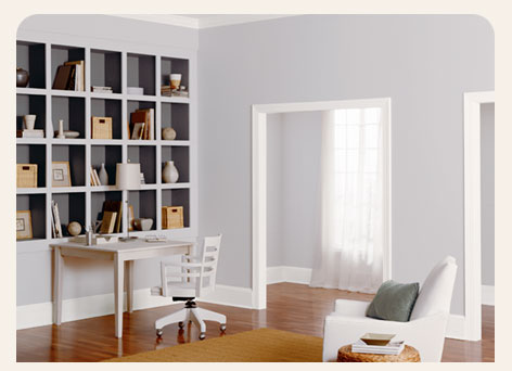
Anyhow, The big neutral these days is taupe and its various incarnations. Some times it's called beige, but I think of beige as a yellowy tan. Taupe is a black brown. For me, the taupes do 
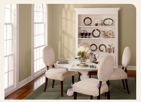
everything I want a neutral to do when I'm using it in a color scheme. And what I want a neutral to do in most cases is back up and allow me to emphasize another element in a room that's in a non-neutral hue. In the dining room pictured here, the designer put together a room that's a vision in neutrals. A lot of times an all-neutral color scheme is there to put people at ease. Since there is no single thing to concentrate on, you can take in everything more easily. If the rear wall were painted a red or a green it would draw attention to that wall and anything on it. Depending on what that accent color is, it could make the room appear to be deeper or shallower.

In the second photo, if the hallway were painted an accent color, it could draw attention to the hall or draw further attention to the living room itself, depending on the accent color. Accent 
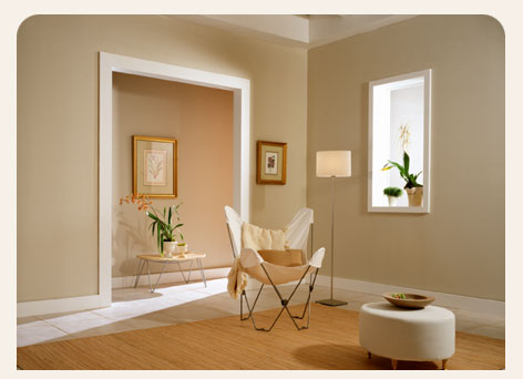
colors are great because they allow you to use an interesting, saturated color that would be too heavy to use on an entire room. I use a lot of neutrals in my work because I love using an 
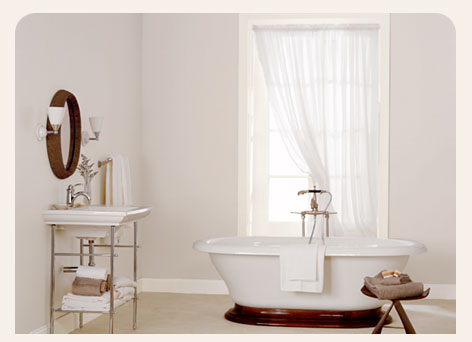
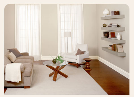
accent wall. A room in an all-neutral scheme can be perfectly fine on its own too as evidenced by these two photos. They come across as being clean and uncomplicated and that's always a good thing. Shades and tones of gray can work just as effectively as the taupes shown here. Gray is an achromatic, or pure neutral and I think people are afraid to use it. Don't be. Gray can be warm, cool, energetic or relaxing depending on the component colors inside of it.

I like to use saturated colors. Most people refer to saturated colors as dark colors, but I don't like to use the D word. My love of saturated colors is not always shared by my clients and so if prompted, I can turn it down. Tints of hues such as red, blue and yellow can function as neutrals too. As with the achromatics and the near neutrals, the point of them is that they blend with most of what's around them.


Here is a red neutral.


Here is a yellow neutral.


Here is a blue neutral.


Neutrals needn't be ho-hum or the last refuge of the indecisive. Neutral schemes can be interesting and lively too. In the kitchen shown to the right, the chocolate brown walls are a terrific counterpoint to the white 
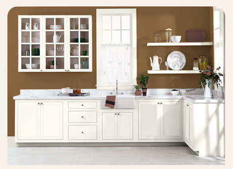
cabinetry. The stark white cabinetry has a marble counter that's acting as a buffer between it and the wall color. The marble in the photo is Carrera, and Carrera always has some brown in it already and in this case, that latent color in the counter is making the bridge effect of the counter even more effective. As attractive as I find that color scheme, it is not for the faint of heart and not something I'd attempt in a galley kitchen.

In the photo here, two neutrals have been joined to make a checkerboard of two yellow tints. It's pretty cool looking and as interesting as it is, it doesn't beat you over the head. Attempting a painting technique like this is 
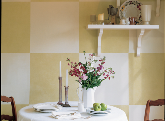
a bad idea if you don't know what you're doing. Our friends at HGTV and Lowe's want you to believe that you can do this sort of thing with no training or practice and I feel compelled to tell you that you can't. Nothing looks worse than a do-it-yourself project that looks like a do-it-yourself project. Using masking tape to achieve an effect like this is difficult and time-consuming and it's very challenging to keep wet paint from bleeding under the tape. Checkerboard patterns and stripes only look good when the edges are sharp and clean. If you still feel like you want to do this in your home, practice (and I mean practice) until you can achieve these effects perfectly and repeatedly. Once you've mastered it, then take on whatever you want with my blessing. Until then, faux painting is a profession for a reason. Hire someone who does this for a living and you'll be happier with the result, believe me.

07 February 2008

Who cares about color theory? Well, me for starters.

In looking back at the color wheel stuff I posted yesterday, I was struck by how impractical the basic, wheel-derived color schemes seem when you look at the colors on a wheel itself. People tend to shy away from simple, fully saturated colors like candy apple red and kelly green. But as I mentioned yesterday, actual practice of this stuff is more nuanced and it depends on more than wall colors to tie it all together.

So I found some real-world applications of the concepts I listed yesterday and here they are:

This is a monochromatic bedroom. The blues are all closely related; and are in fact tones, shades and tints of the same color. If you remember, a tone is a base color with gray added to it. A shade is a base color with black added to it. And a tint is a base color with white added to it.

Most times, when you look at a paint company's fan deck, the individual pages of it are arranged as monochromatic color schemes. In the room pictured, two of the blues come from the wall and trim paint. More blues come into the room through the bedding and even the irises in the vase on the night stand.

The brown wood tones, the white pillows and the steel lamp are all neutrals. Neutrals are a topic for another day, but for now it's safe to say that black and white are true neutrals and browns are near neutrals. Neutrals go with everything, hence the name.

This is an example of a complementary color scheme. As I mentioned originally, there is some nuance to this. The yellow of the wall and the blue of the cabinet are in opposition on the color wheel even though they aren't in direct opposition.


This is an example of a triad. A triad combines three colors that are equally spaced on the color wheel. In this case, the walls are yellow, the sofa is red and the chair in the foreground is blue.


This is an example of a split complement. A split complement combines the hues to the left and right of a particular color's position on the color wheel. In the example here, the wall is red-orange and red-violet. The third color, green, is coming from the foliage in the vase.


This photo shows an example of an analogous color scheme. An analogous scheme uses colors in consecutive order from the wheel. In the room pictued, the designer used yellow, yellow-orange and orange together to make up a cohesive and balanced room.

So theory does have some practical applications after all. But man does not live by the color wheel alone, and tomorrow I'll regale you with the wild tales of the neutrals and the near neutrals. I don't think that Banana Republic, the Gap, Calvin Klein or many others would exist were it not for the achromatic world of taupe, white, brown, gray and black. If I'm still feeling expansive, I'll get into what's being called the "new" neutrals. Shhhhh, don't tell anybody, but they're actually tints.