17 April 2008

What's modern and what's contemporary?

I had a client come to me some months ago and she wanted to do a gut and re-do to the first floor of her house. As we discussed the direction she wanted to go with her renovation, she repeatedly used the term "modern." As in "I want everything to look modern." She didn't show any photos or clippings she'd collected that looked like what she wanted and I didn't have her go through any of my books so she could show me things that she liked the way I usually do. She was pretty determined to get what she wanted and what she wanted was Modern in her words.

I work in how things look, but I have to describe how those things look in pretty exact terms. Modern means something very specific to me. It means no ornamentation, it means simple lines, it means repetitive shapes. Modernism relies on the big picture to set a mood. Modernism asks you to step back and take in the whole thing rather than concentrate on smaller vignettes and details. Modernism is the Guggenheim on Fifth Avenue. Modernism pares down forms to their barest essence and asks questions of me like "how to I maintain total function while using the fewest numbers of shapes?" Modernism makes people live simple and uncluttered lives, modernism makes someone throw away the junk mail as it arrives and pay their bills on time. Modernism is minimalism. Always. I love Modernism. I love it I love it I love it.

I set about a plan for my client and I took a good week-and-a-half to complete some preliminary drawings and find some samples of the finishes I would use in her newly Modern home. Modernism is a classic --it's timeless. I love telling myself that my designs for a client will stand the test of time and I was pretty happy with the direction I was taking this client's home.

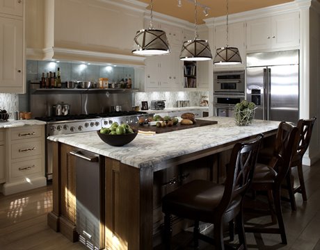
She hated it and I had to re-do everything. I lost another week coming up with a new direction. It wasn't a total loss though. Armed with my concept drawings, we now had something to talk about and she could show me what she wanted. Unfortunately, the drawings were examples of exactly what she didn't want. She wanted ornamentation. She wanted small picture stuff. She wanted every sight line in her renovated home to feature a series of focal points that related to one another. She wanted crown moldings and inlaid floors and paneled appliances. She wanted original and she wanted something very now. About five minutes into my presentation I saw that I'd missed the mark completely and I did so because we weren't using the same vocabulary.

She had been using the term Modern to describe Contemporary. Contemporary is a very different thing from Modern. Contemporary means Now. Contemporary isn't timeless and a classic. There's absolutely nothing wrong with Contemporary, it's just another thing all together. Contemporary is never minimalist and that's the easiest way to identify it.

Using architecture as an example again, if Frank Lloyd Wright's Guggenheim on the Upper East Side is Modern, then Michael Graves' Swan Hotel at Disney is Contemporary. The Swan Hotel is a marvel --it's impossible to walk around it when you're in a hurry. There is so much going on with it, yet all of its parts combine into a cohesive whole. As with anything Michael Graves designs, it has a sense of whimsy about it that makes it sit perfectly in the middle of an amusement park. The Guggenheim on the other hand sits on the corner of Fifth Avenue and 89th Street in a neighborhood lined with tall apartment buildings and across from the leafy expanse of Central Park. Its rounded lines form a perfect bridge between the hard surfaces and lines of the buildings on the east side of Fifth Avenue and the trees in the park on the west side. It's also impossible to hurry past, but because its simple facade contrasts so strongly with its surroundings.

The lesson? If you're going to embark on a renovation and you're going to talk to a designer about it, start a clip file of things you like. Be sure that you and whoever you're talking to share a vocabulary. My lesson? Anybody who comes to me without such a clip file is going to spend some time in my design library. Clients and I need to speak the same language, even if we have to make one up.

15 April 2008

Is there such a thing as a sustainable counter?

There's a lot of talk about the need for and the importance of using renewable, sustainable materials and practices in home construction and it's difficult to get a clear picture about what's "green" and what's not. Avonite makes a solid surface counter material that it markets with a recycling symbol. Avonite's recycled patterns do have chopped up scraps of solid surface in them and it's better that those scraps end up in a counter than in a landfill, but solid surface is hardly a benign product. Between its petroleum-based polymers and the powdered aluminum ore that is all solid surface materials' primary ingredient, making it leaves behind a toxic soup. Even so, recycling some of their industrial waste is laudable, but it doesn't negate the unsustainability of their product.

Natural stone counters are inert for the most part, but quarrying and transporting them around the globe brings a host of environmental and human rights along for the ride.

Quartz counters are made from stone aggregates of questionable origins and a whole lotta petroleum. They are unrecyclable and don't biodegrade.

So what's left? It seems that everywhere I turn I find something non-renewable or non-sustainable when I go to specify a counter material.

Or maybe not. There are two products that have recently come to my attention as possible "green" substitutes for the counters that end up in most peoples homes now.

The first is a product called Fireslate. Fireslate is made by a single manufacturer in East Wareham Massachusetts and has been around since the early years of the 20th century. Fireslate was developed originally as a fireproof lining for the undercarriages of cars but it makes for an interesting counter top. Fireslate is also what the counters in my High School chem lab were made from. I think that's what all chem lab counters were made from it now that I think about it. Anyhow, Fireslate is made from cement, sand and recycled paper and looks for all the world like soapstone. It's available in a few colors beyond black and gray and I predict that it's appeal will grow in the coming years and that they won't be the only manufacturer of this material for long. In the meantime, their website isn't the most helpful thing out there and finding photos of a Fireslate counter is quite the task. It does seem to have a large following out there though. Fireslate is rock hard and needs to be treated with tung oil to keep it sealed. It does scratch and develop a patina in the same way that soapstone does and is water resistant enough that it can be used to make sinks. Interesting stuff this Fireslate, I just wish the company behind it did a better job of telling me about their product.

The second product I found is also made from sustainable wood pulp. Yes, these are counters made from paper essentially. Tacoma, Washington-based Richlite is the manufacturer that gets the most attention, and they have a pretty helpful website. Richlite is heavy, heat, scratch and bacteria-resistant. The counter to the left is a Richlite counter.

Another Washington-based company is making a sustainable and non-toxic product called Paperstone. Paperstone is made from post-consumer recycled paper and a resin derived from cashews. It's interesting stuff. To the right is a vanity top made from Paperstone.

So there are products out there that do take this environmental responsibility thing seriously. I think you'd do well to think about them at he very least if you're in the market for a new counter. Even if you're not, these three products are the leading edge of a something we'll be seeing more and more of in the coming years. And that my friends, is a very good thing.

14 April 2008

Listen while I opine some more about counters.

I love granite as a counter top material. It has a liveliness and a depth to it that other materials can't come close to. How cool is it to bring something into your home that was once part of the seething cauldron below our feet? It's neat stuff all right, and when it first started to appear in American homes about 20 years ago it was a luxury item. Now it's everywhere and using it in a kitchen renovation is practically a standard. As it's caught on and become more popular it's also become less expensive. No one's giving it away, that's for sure. But gone are the days when it cost as much as a car to have put in your house.

As it is with most things, granite is beginning to suffer from its own popularity. The fact of its near omnipresence has certain segments of the market looking for something else. Don't get me wrong, you cannot go wrong with having granite counters. But even so, my mind does wonder sometimes to what else is out there.

I mentioned Quartz tops in my last post and I want to look at a couple of other new materials that are beginning to show up. As with most new stuff, these new materials are making some inroads in the high end. And just as it does with just about every other aspect of life in a consumer culture, what the high end goes for today is what the masses go for tomorrow.

I often refer to Quartz as a variation on terrazzo. Well, there's a company called Vetrazzo and they are onto something. Vetrazzo is a Richmond, CA based company that makes actual terrazzo for use as counter tops, and they make it out of recycled glass. It's really pretty stuff in the right setting. The pattern above and to the left is Indochine Amythest and it is made from discarded glass and fine grade cement. It's shiny, hard, scratch-resistant and all of the other things you'd expect a counter to be. Yet because of its glass content, it has a depth that quartz tops can't touch. To the right is a pattern called Green Vetrazzo. I'll give you a quarter if you can guess its primary ingredient.

Also interesting and incredibly expensive is a product from France called Pyrolave. Pyrolave the counter material is made from a very dense volcanic rock from the Auvergne region in France. Pyrolave quarries this volcanic rock in the same way that one would quarry granite or marble. Then they do something completely different --they glaze it the way one would glaze pottery. Pyrolave is available in many colors, in both glassy and matte finishes. These counters are templated on site, fabricated in France and then installed by team of crack tradespeople flown in just for you. I can't imagine how much all of that costs by the time it's all said and done, but what's notable here is their method. Glazed stone is a material unlike anything I've ever seen. I touched a Pyrolave counter at a trade show last year and I was really blown away by it. It feels for all the world like a single piece of ceramic. Absolutely amazing stuff, and it wouldn't surprise me at all if some enterprising Yankee came up with a way to do a similar process to a more prosaic material.

So what does all of this mean? Well, it means that there's a world of innovation out there and someday soon, those innovations will trickle down through the market. Just in time for people like me to rediscover Formica. Hah!

13 April 2008

Counter currents

Last week, I had a visit from the Florida rep for Caesarstone. Caesarstone is a brand of manufactured quartz that gets used primarily as a counter surface. For anyone who doesn't know, Quartz is the new, at least in the US, category of counter materials. Quartz is made from stone aggregate and polymers and is essentially terrazzo. It is hard, resilient, stain and scratch proof. Its manufacturers also market it with some really wild claims that make it sound a lot better than it is. The truth of the matter is that it is a good product. But it is hardly perfect and it is certainly not going to replace the market for natural stone counters any time soon.

Of the many brands of quartz out there, Caesarstone stands out. It's more expensive than most of the other brands and has a more adventurous palette than the rest of them as well. Caesarstone is harder to find and is unavailable in the big box stores. Caesarstone has a lot of cachet in the industry, and that's due in a large part to its unavailability outside of major markets. For a long time, anybody in Florida who wanted it had to go to Miami to get it. But no longer. Caesarstone is now available to those of us who find ourselves in second-tier cities like mine. I've long admired Caesarstone for their lime greens and bright oranges and now I have a sample kit of my very own. Hot dog! In addition to having more interesting colors than their competitors, Caesarstone's been experimenting with more adventurous finishes too. Some of their concrete- and soapstone-looking materials are really intriguing and well worth looking into if you're in the market for new counters.

Something I've always noticed is the way Caesarstone positions itself too. Silestone, Zodiaq, Cambria, Avanza and the rest of them refer to themselves as an alternative to granite. Caesarstone tends to stand by itself and assert that it's a good product without having to draw comparisons. I think this is a more respectable and honest tack. The truth of the matter is that quartz and granite aren't interchangeable. There are some designs that call for one and not the other. Similarly, there are people for whom quartz isn't appealing or appropriate no matter what kind of smoke DuPont is blowing in its latest ad campaign.

So if the quest for new and different is making you look askance at granite counters, you may do well to take a look at Caesarstone --especially their color Tequila Sunrise.

10 April 2008

Meet Christopher Peacock

Today's New York Times Home and Garden section is dedicated to the humble (or not so humble) kitchen. The lead story is a profile of kitchen designer Christopher Peacock and bears the headline, "The Six-Figure Scullery." Christopher Peacock is the only kitchen designer I can think of who has turned his name into a brand successfully. There are some other eponymous brands out there, e.g. William Ohs, Clive Christian; but those guys were cabinet and furniture makers before they started on kitchens. Christopher Peacock started at a drawing table, just like me.

Anyhow, Christopher Peacock's signature style is a stylized Edwardian throwback and he charges dearly for his look and his wares. He's important because his aesthetic is catching on faster than his name and I have had a rash of people requesting things that are very similar to his "Scullery" pictured above.

When the Mediterranean and Tuscan styles started to fade away from the popular press I started expecting the new must-have to be a transitional contemporary. And I have done a lot of that sort of design over the last two years. But transitional contemporary hasn't really gelled into a real aesthetic. It seems to me that it's a reaction, nearly a backlash against the overdone Mediterraneans that dominated the design press for years.

Peacock represents something else entirely. His is a genuine, defined aesthetic that stands on its own, it doesn't appear to be a reaction. His designs, as originals, command prices far beyond the budgets of most people. I will not be at all surprised though to see more and more Peacock-inspired rooms to show up in the press and in the minds of the people who call on me. It's interesting stuff and I welcome it whole heartedly. Let me use painted, inset cabinetry and marble counters any day.